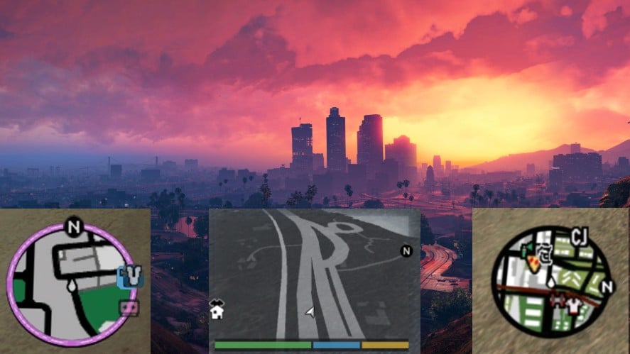
The release of GTA 6 is expected to bring significant changes in various aspects, especially in the HUD and mini-map. These changes are likely to be a major part of the game’s overall update.
If you’re wondering what the mini-map will look like in GTA 6, then this post is perfect for you.
The New Mini-map In GTA 6
In earlier versions, such as GTA Vice City and GTA San Andreas, the mini-map had a simple and mostly 2D design. However, in the next GTA 5 edition, the mini-map has undergone a modern redesign, incorporating various new features that are introduced for the first time.

Just because it’s said that way doesn’t mean the mini-map in GTA 5 was perfect, as there’s always room for improvement.
That said, the potential new interface of the mini-map in GTA 6 is rumored to be a game-changer.
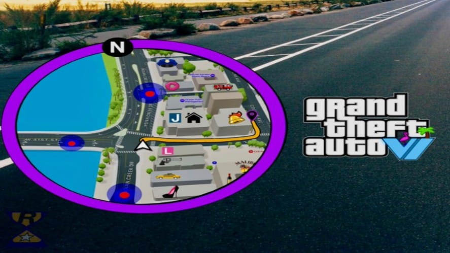
A recent post on Twitter showcased a prediction of GTA 6’s mini-map, revealing it as a blend of GTA Vice City’s mini-map and the inclusion of 3D elements.

The elements on the mini-map are now displayed more clearly, with enhanced visibility and a wider array of colors, making it more accessible compared to the one in GTA 5.
Moreover, street names are now integrated into the mini-map, unlike in GTA 5, where they appear in the bottom right corner of the screen. This notable improvement allows for more accurate navigation and coordination within the game.
While the official look of GTA 6’s mini-map remains unclear, many fans are looking forward to the next update, anticipating it will bring many new features.


